The platform is a project management tool built to be scalable, but primarily aimed at professionalize the client's business, improve workflow management, and add value by providing clients with a reliable platform to track project progress, upload raw videos, request urgent tasks, and centralize communication.
2024

Saas Dashboards
case study

no monkey business
The client, a well-known video editor serving prominent creators, especially in the YouTube Kids niche reached out to me through an online platform having previously attempted to build this platform with other professionals without success, he already had a well-mapped workflow of the desired processes and interactions. However, the previous solution lacked a polished look and suffered from many usability issues. The challenge was to optimize the existing structure and create a streamlined, user-friendly interface.
scope of work
User Experience
User Interface
Prototyping
Seamless handoff
timeline
6 months
high level goals
01
Convey professionalism
Create a polished and professional platform that adds perceived value to the client's services, enhancing credibility and customer satisfaction.
02
Improve Usability
Provide a centralized platform for project tracking and communication between clients and collaborators, enhancing information hierarchy to offer a seamless user experience
03
Ensure accurate implementation
Develop detailed documentation to facilitate third-party implementation without deviations.
This phase involved a thorough review of the existing workflows and previous attempts to build the platform. I conducted a usability analysis to pinpoint issues such as redundant elements, poor information hierarchy, and inefficient interactions. Collaborating closely with the client, I gathered detailed requirements and aligned expectations to establish a solid foundation for the project.


The existing interface contained redundant buttons and inefficient layouts. Some interactions, like filtering project status, were not optimized
Poor information hierarchy was hindering readability and usability
Unused screen space affected user focus and interaction efficiency
The overall experience lacked coherence and professionalism
solution requirements
Remove redundancy and simplify interactions
Enhance information hierarchy for better readability
Optimize layout to make better use of screen space
Ensure a consistent and professional visual style

before and after
delivery
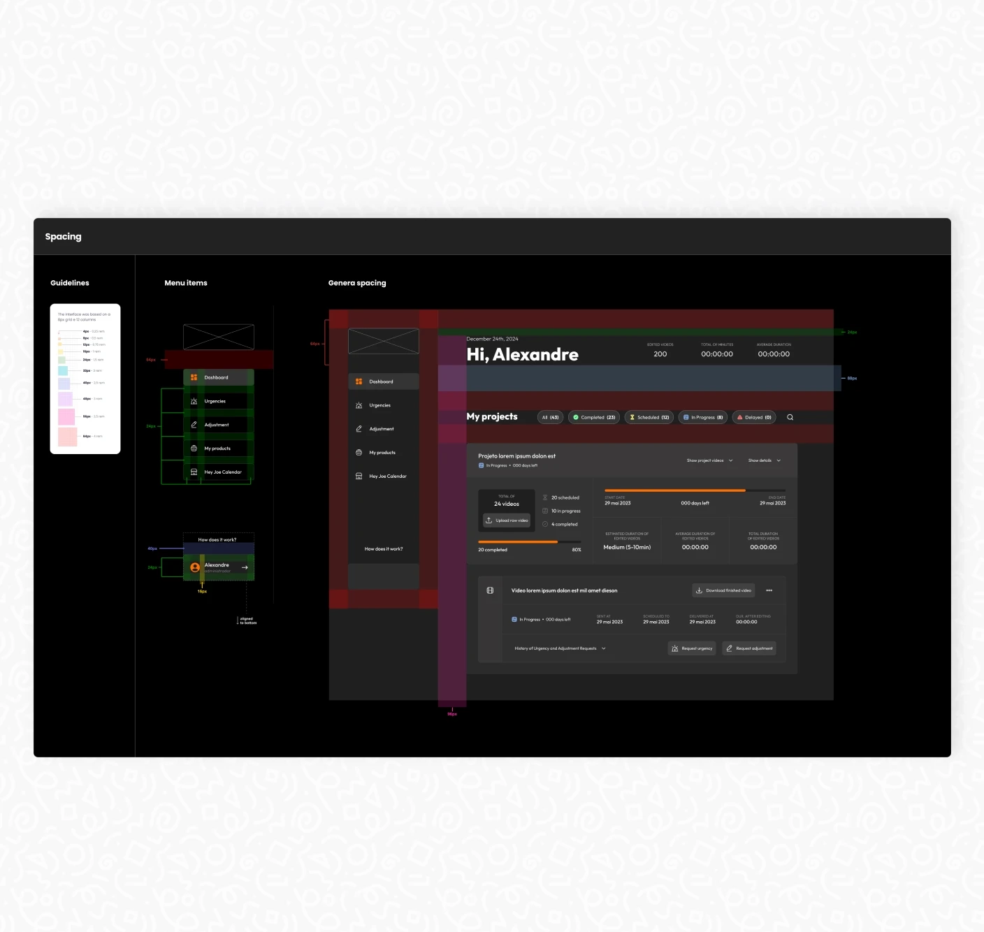
A comprehensive style guide was developed, including all typography, colors, images, animations, inputs, buttons, and spacing used throughout the interface. This meticulous documentation ensured that third-party developers could accurately implement the design without discrepancies.